Frenzii turns creator videos into a buying frenzy. It shows a brand which videos sell, and hands over the few moves that make more of them.
Round two: nine new directions
A wider spread this time: some change the lettering itself, some add a symbol, and one moves. They are first drafts for choosing a direction. The one you pick gets redrawn cleanly and matched to the site.
Turn the two i’s upside down and they are two exclamation marks. The name flips into the feeling and back, so the logo itself is the frenzy. The app icon is the two exclamation marks on orange. This one I drew by hand in the site’s own lettering, so it is already clean.
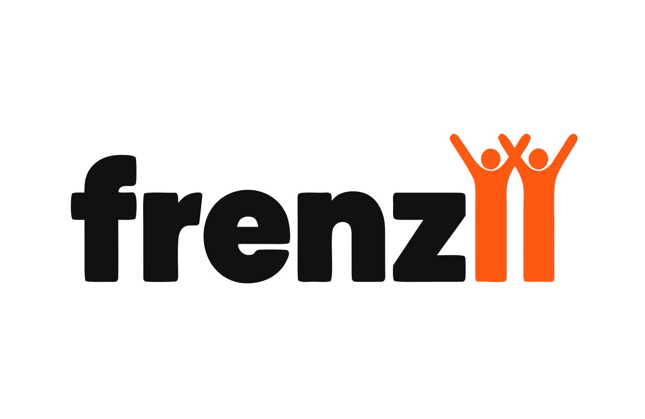
The two i's become two people with their arms up. Creators, buyers, a crowd going wild. The name does the work with no icon.
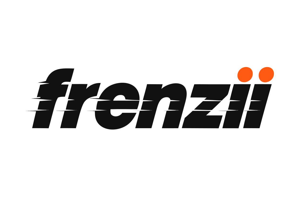
The whole name leans forward with speed lines cut into it. Momentum, like a sports brand.
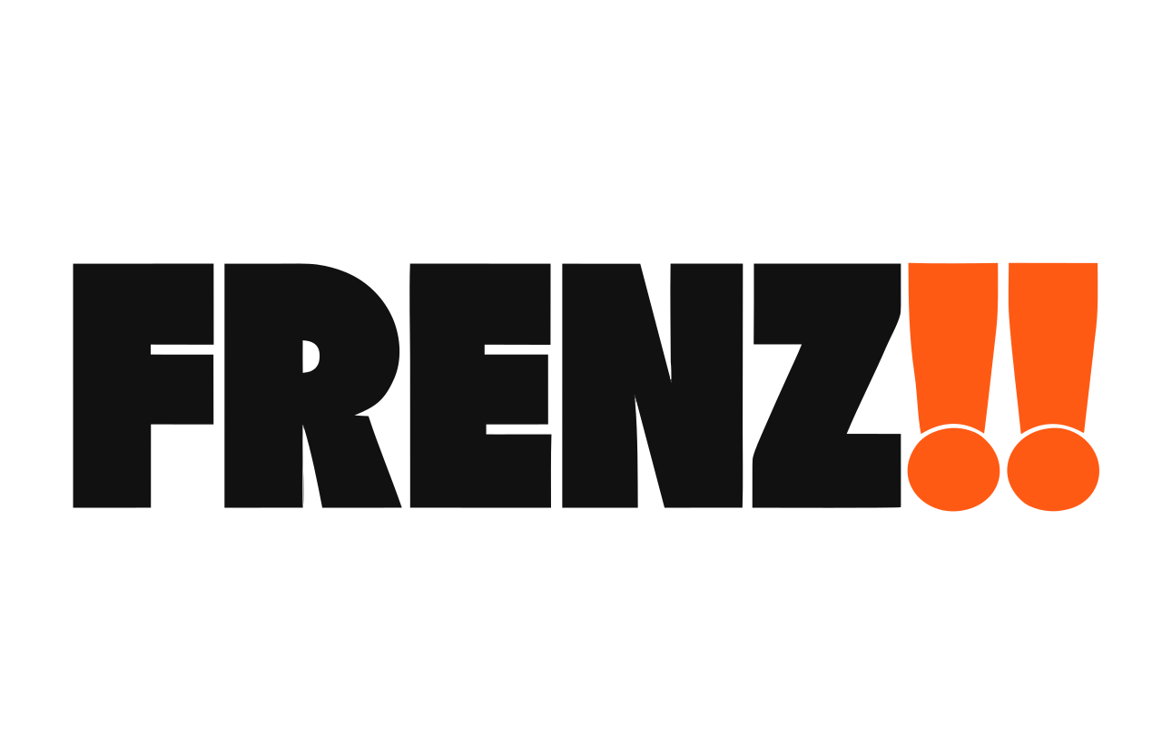
Wide capitals, with the two I's turned into exclamation marks. Loud on purpose.
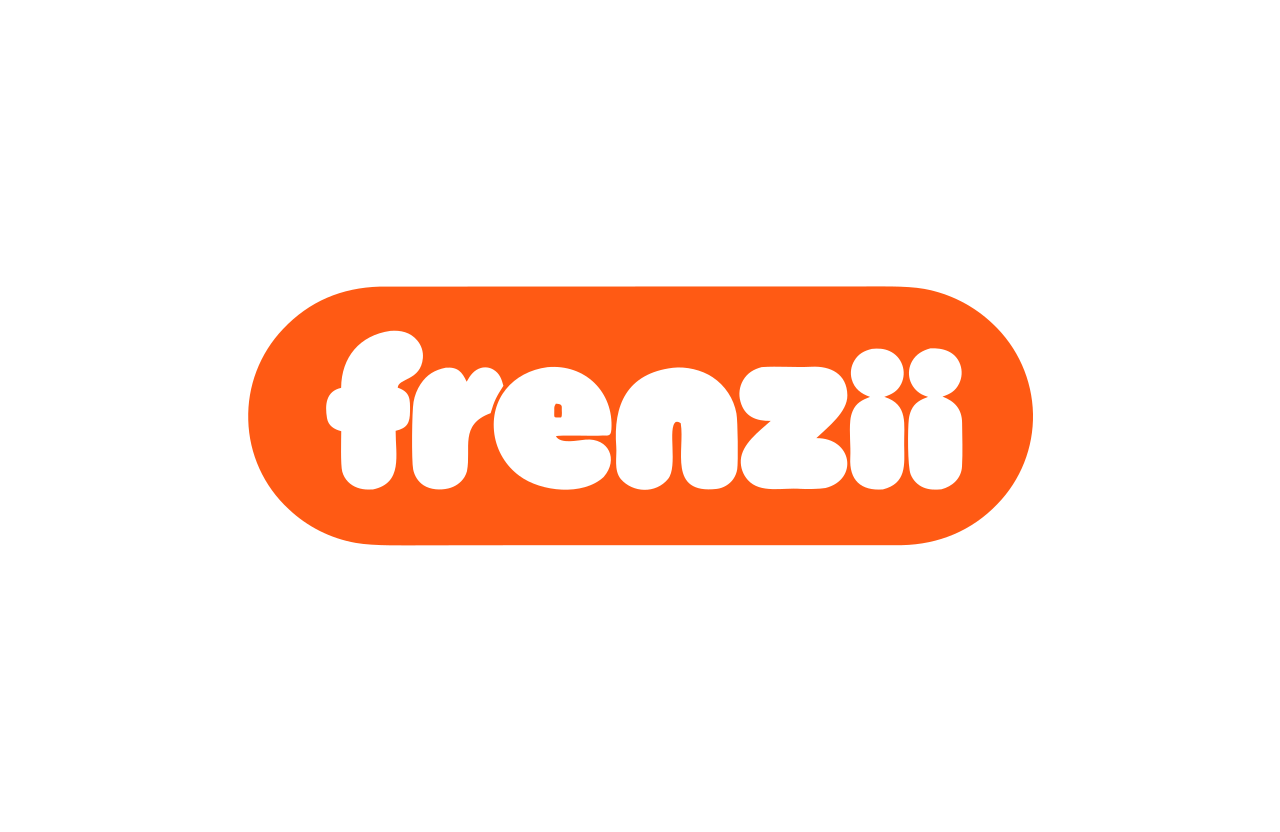
Soft round letters in an orange pill, like something you want to press. The friendliest of the set.
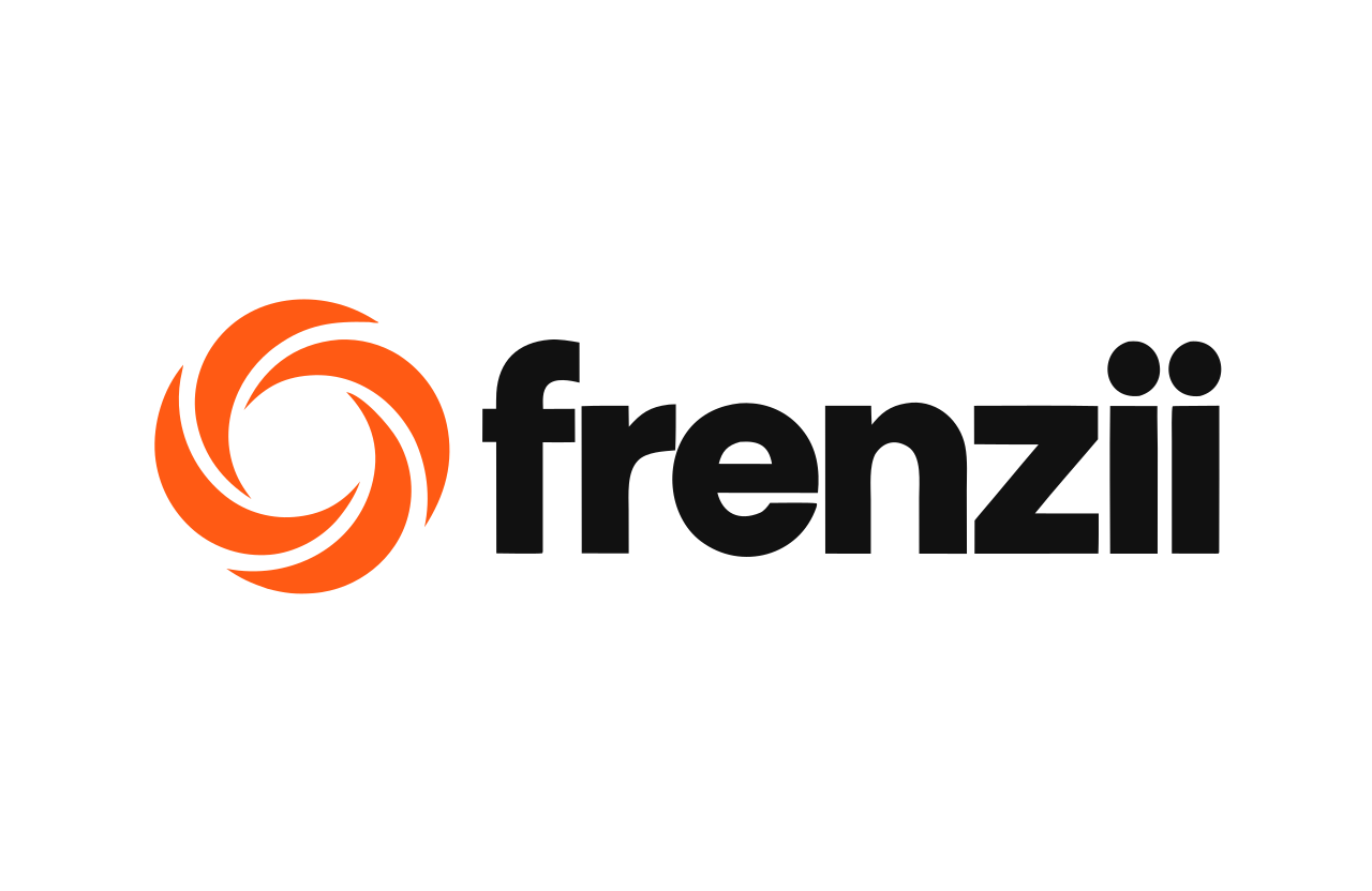
A whirlwind symbol: a frenzy pulling everything in.
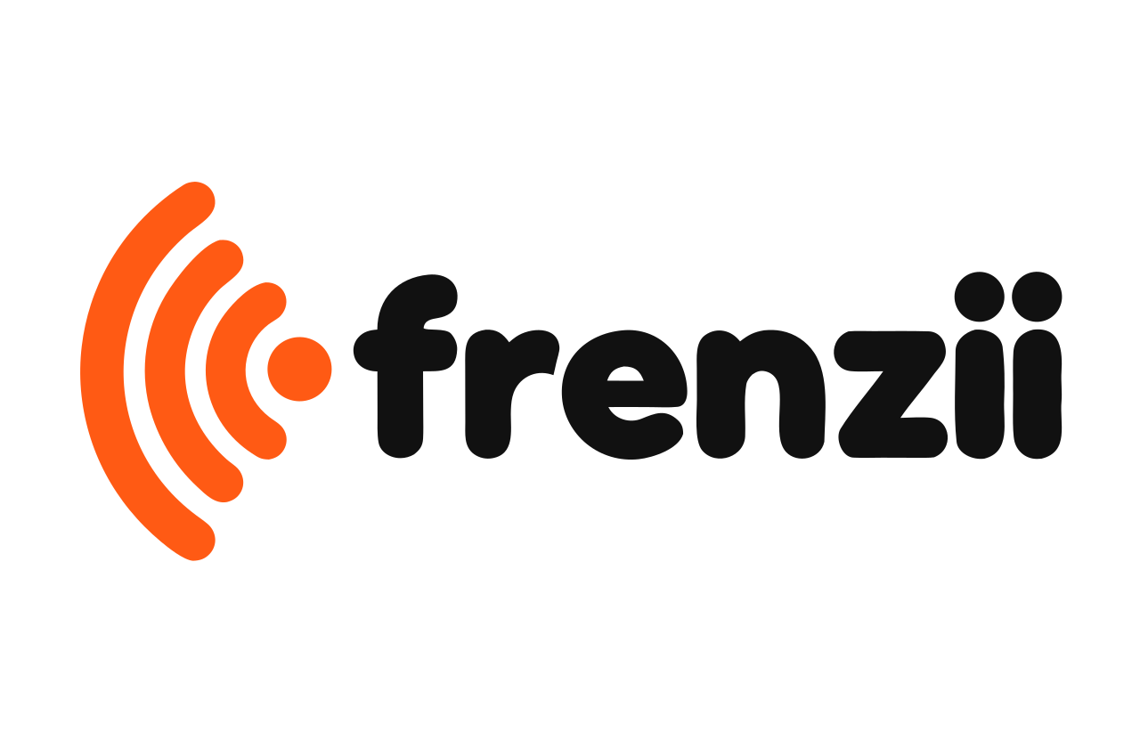
One point sending waves outward: a single video spreading.
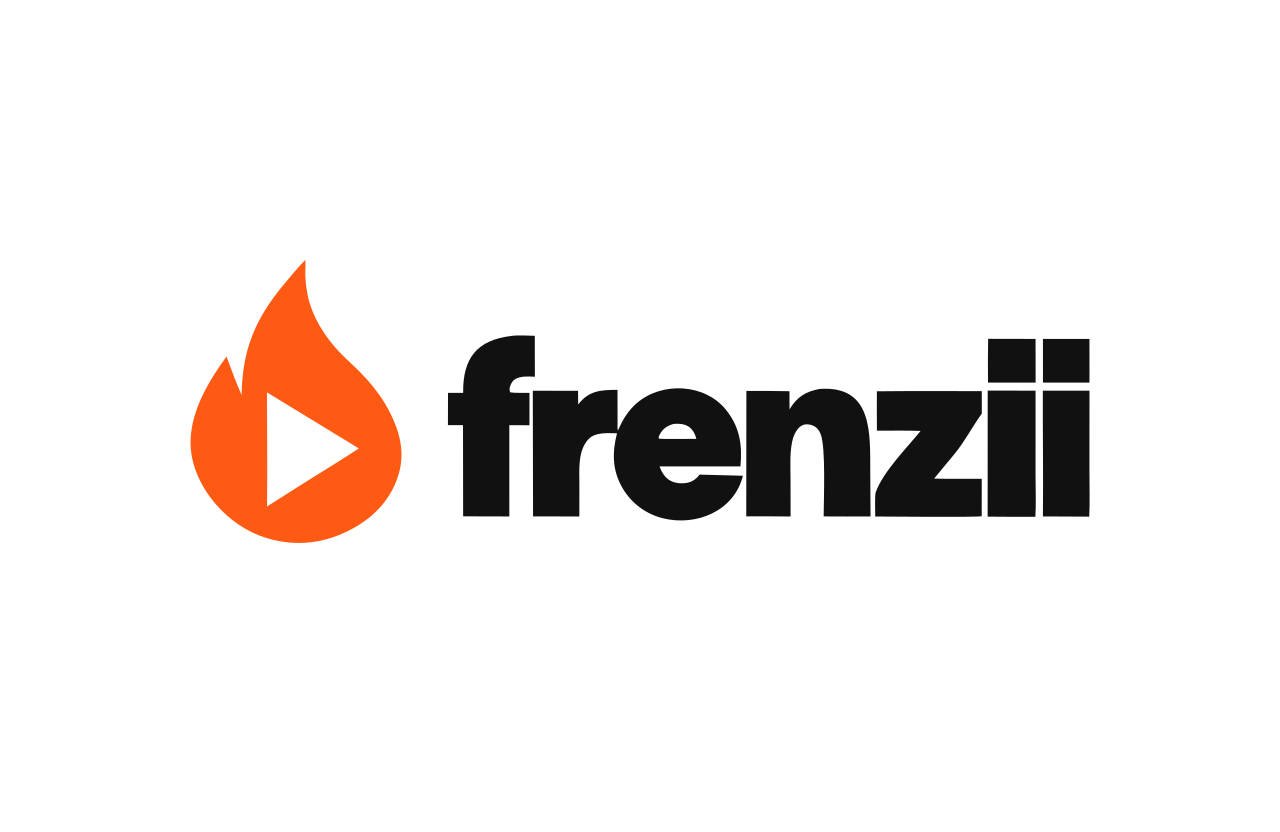
A flame with a play button inside it: a video catching fire.
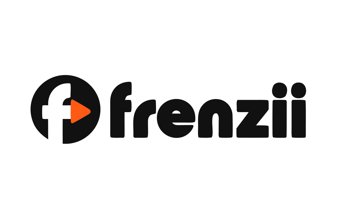
An f whose crossbar is a play button, in a black circle. Built to be an app icon first.
Eight versions of the current idea
In every one, both i’s stand the same height, so the name reads “ii” to someone who has never seen it. In six of them only the second dot changes; two change the lettering. The one marked live is what the product uses now.
Two voices, the second one louder. One creator's video becomes a crowd buying. Simple enough to work at any size.
Two equal dots: the brand and the creator, side by side. The calmest and most classic of the four.
The second dot catches fire. The moment a video takes off. Note that a four-point spark is also widely used to mean AI.
The second dot is a play button. It says video straight away, and is the most literal.
A ring spreads out from the second dot: one video reaching far past the person who made it.
The second dot goes off like a notification. Attention, orders, a frenzy starting.
All capitals, with the two I's as orange bars. Loud and blunt, and the bars read as a pause button, which says video.
The whole name leans forward. Speed and momentum, with the two equal dots kept simple.
Two people. The second one louder.
The two i’s at the end of the name are two people standing side by side: a creator and the buyer they bring, or one creator and the next. They stand the same height, and the second dot is bigger. A video gets posted, and the response is larger than the post. That is the whole business in one shape.
The mark is always white on orange. In the wordmark the two dots are the only colour.
Colour
White, ink and one colour. Orange is the moment something sells, so it is kept for the things that matter and never used as decoration.
The one loud colour. Fills only: main buttons, the mark, counts.
Text, and the dark canvas.
The light canvas and every card.
Orange when it has to be read: links, chart lines, the selected state.
Type
Three of their videos sold $956 this week. Send another sample or a brief while it’s working.
frenzii.co/brief/k3v9x2
Shape and motion
Anything you press is a full pill. One orange button per screen: the move we recommend.
Things rise. Cards, numbers and the loading mark all move upward, quickly, then settle. Nothing spins or bounces for show.
Things that hold content are soft rectangles with an 18 pixel corner. One thin line, one quiet shadow.
Voice
- Say what sold.
- Lead with dollars and names. "@maya.finds sold $4,280" beats "strong engagement".
- Say what to do.
- Every screen ends in a move a person can make today.
- Short words.
- No jargon, no hype words. If a brand owner would not say it out loud, cut it.